Creating a harmonious and inviting space often relies on more than just furniture and layout. Understanding the psychology of colours in home design plays a pivotal role in setting the mood and functionality of any interior. This comprehensive guide will delve into the basics of colour theory, explore how various shades influence our emotions, and provide practical tips for applying these principles in your home.
Let's get straight to the point
Understanding the psychology of colours in home design is key to creating aesthetically pleasing and functional spaces. This guide explores the basics of colour theory, including the colour wheel and its primary, secondary, and tertiary hues and how these relate to emotions.
Colours significantly influence interior design. Cool tones like blues and greens offer tranquillity, while warm tones like reds and yellows evoke energy. The interplay of lighter and darker shades, vibrant tones, and natural light shapes a room’s ambience. Strategic use of accent walls, complementary colours, and calming tones can transform any space. Designing with colour psychology involves tailoring palettes to a room’s function, experimenting with hues, and balancing warm and cool tones.
By embracing these principles, homeowners can craft personalised, inviting interiors that reflect their moods and personalities through subtle nuances or bold contrasts.
Introduction to Colour Psychology
The psychology of colours examines how hues influence human emotions and behaviour. In interior design, this understanding is essential for crafting spaces that evoke specific feelings, whether it's relaxation, energy, or creativity. Different hues have unique impacts, from cool tones like blues and greens to warm colours such as reds and yellows.
The Colour Wheel and Its Primary, Secondary, and Tertiary Colours
The colour wheel is the foundation of colour psychology and visually represents relationships between colours. It consists of:
- Primary colours: Red, blue, and yellow. These cannot be created by mixing other colours.
- Secondary colours: Green, orange, and purple, made by mixing primary colours.
- Tertiary colours: Variations like red-orange or blue-green, formed by combining primary and secondary hues.
Understanding these relationships helps select complementary colours, creating balance and harmony in any space.
The Role of Colours in Interior Design
Colours aren’t just decorative—they significantly shape a room's ambience. Whether you choose vibrant tones to energise a space or calming colours for relaxation, each choice reflects the principles of interior design psychology.
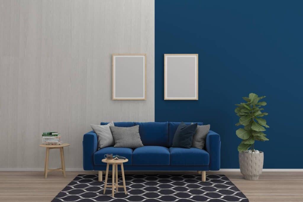
Cool Colours
Cool colours, including blues and greens, are associated with tranquillity and serenity. Sky blue or pale green shades create expansive and peaceful spaces reminiscent of the sea or swimming pools. These hues are ideal for living spaces or bedrooms.
Warm Colours
In contrast, warm colours like reds and yellows exude energy and warmth. They are great for communal areas such as the dining room, fostering a welcoming atmosphere.
Colour Psychology in Practice
Light and Dark Shades
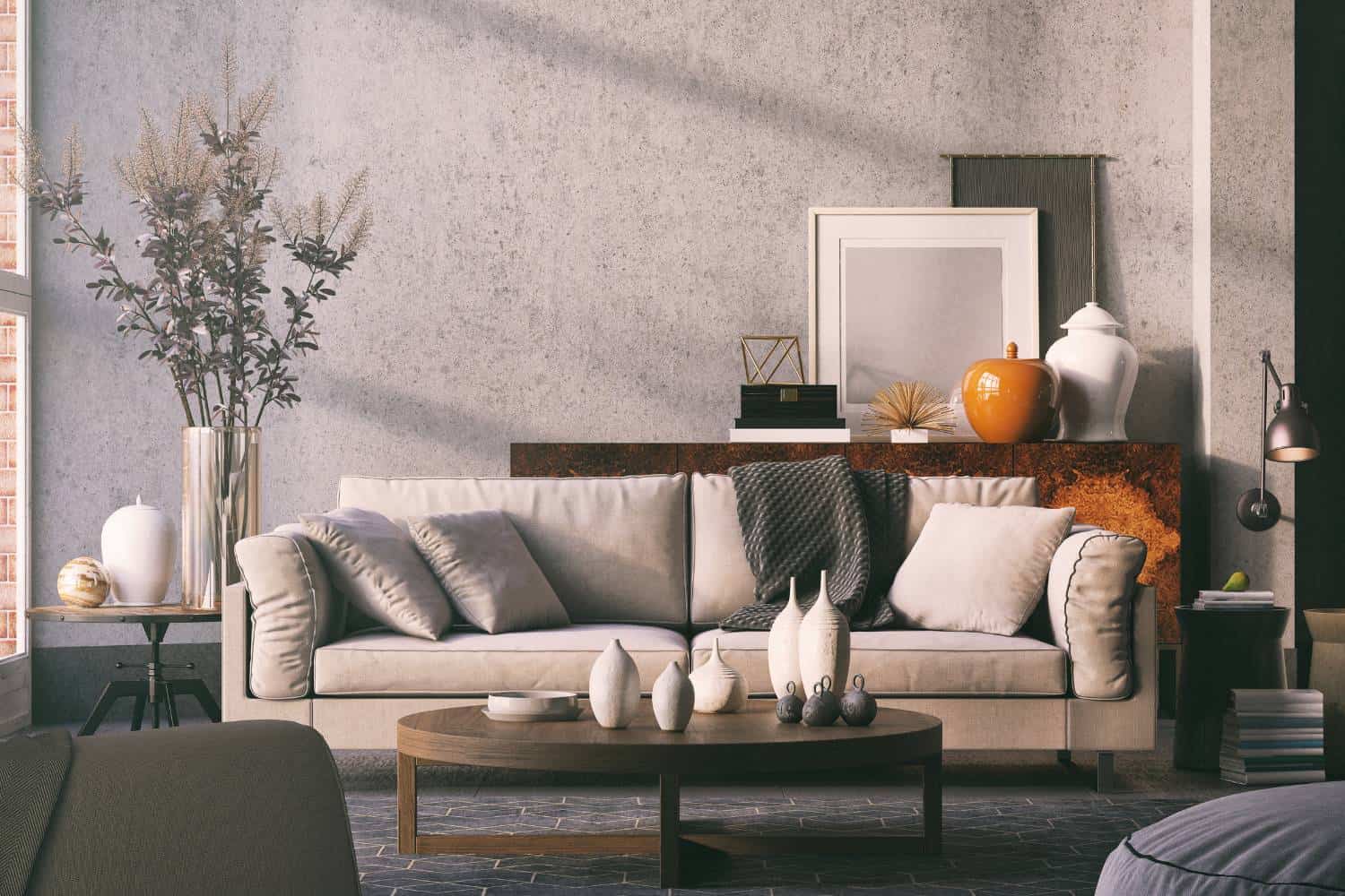
Lighter shades reflect natural light, making rooms feel more open and airy. Using lighter hues like light blue or light green creates a bright room, perfect for smaller spaces. On the other hand, darker shades, such as olive green or navy, add depth and a sense of sophistication.
Vibrant Shades and Deeper Shades
Vibrant shades like bold reds or yellows infuse energy, while deeper shades evoke a more intimate and cosy feel. These contrasts are key in creating accent walls or dividing zones within an entire room.
Warm and Cool Tones
Mixing warm and cool tones creates dynamic interiors. Pairing warm colours with cool tones can create contrast and visual interest.
The Importance of Natural Light in Interior Design
Natural light dramatically affects how colours affect a space. Sunlight can make vibrant shades pop, while artificial lighting may emphasise different hues. Incorporating natural hues ensures your room remains adaptable throughout the day. Use lighter and softer deviations of colours to capitalise on sunlight and achieve a cheerful vibe.
Choosing a Colour Palette for Your Home
Selecting a colour palette begins with identifying the mood you want to convey. Consider:
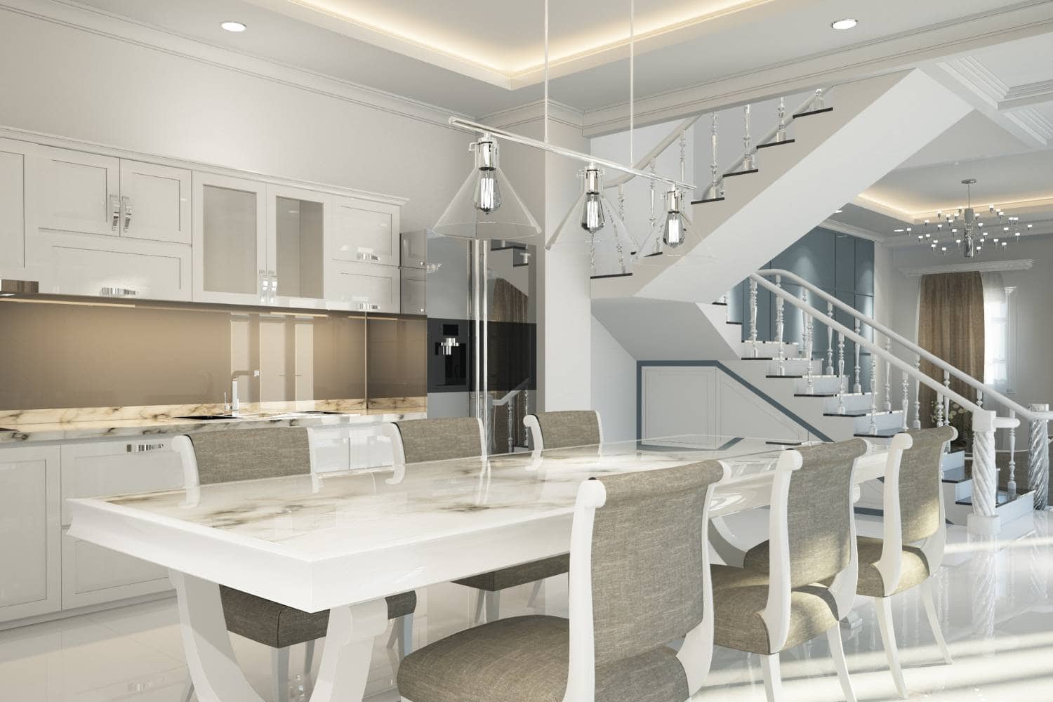
- Neutral Base: Start with a blank canvas of whites or greys.
- Accent Colours: Add interest with complementary colours or popular colour schemes.
- Room Function: Tailor colour schemes to the purpose of each room.
Interior designers recommend blending different shades and experimenting with colourful spaces for a balanced look while maintaining coherence.
Tips for Using Colour Psychology in Interior Design
Implementing colour psychology in interior design effectively involves thoughtful planning:
1. Experiment with Different Colours
Use paint swatches or sample tiles to see how various shades look in your space under different lighting conditions.
2. Incorporate Calming Colors
Soft blues and greens can lower blood pressure and are ideal for bedrooms or bathrooms. Purple inspires creativity, making it great for spaces like studios or offices.
3. Use Accent Walls
Highlight a wall with a bold hue, like dark green or vibrant tones, to draw attention and add drama.
4. Play with Complementary Colours
Pair opposites on the colour wheel, such as orange and blue, to create visually stimulating interiors.
5. Choose Colours for Specific Moods
- Dining Room: Opt for warm tones to encourage conversation.
- Creative and Performing Arts Spaces: Incorporate stimulating colours like purple or red.
Conclusion
Understanding the psychology of colours in home design empowers homeowners to craft beautiful and functional interiors. By applying principles of colour psychology, leveraging the colour wheel, and considering factors like natural light and mood, you can design spaces that truly reflect your personality. Every choice, from lighter shades to darker hues and calming colours to vibrant shades., creates a home you'll love
Whether planning an entire room overhaul or adding touches like accent walls, let the art and science of interior design psychology guide you. Embrace the journey, experiment with different colours, and transform your living spaces into a sanctuary of style and purpose.
Frequently Asked Questions
Colour psychology in home design studies how colours influence emotions and behaviours within spaces. It helps homeowners create rooms that evoke desired feelings such as relaxation, energy, or creativity.
Warm colours like red and yellow add energy and warmth, while cool colours like blue and green create tranquillity and spaciousness. Thus, they are suitable for different functional areas in a home.
The colour wheel helps designers understand relationships between colours, such as complementary and analogous hues. This enables balanced, harmonious interiors to blend primary, secondary, and tertiary shades.
Natural light enhances colours by altering their appearance throughout the day. Lighter shades optimise sunlight, while darker tones may appear more subdued in dim lighting.
Accent walls use bold colours or deeper shades to highlight specific areas in a room. They add visual interest, create focal points, and enhance the overall design scheme.


